
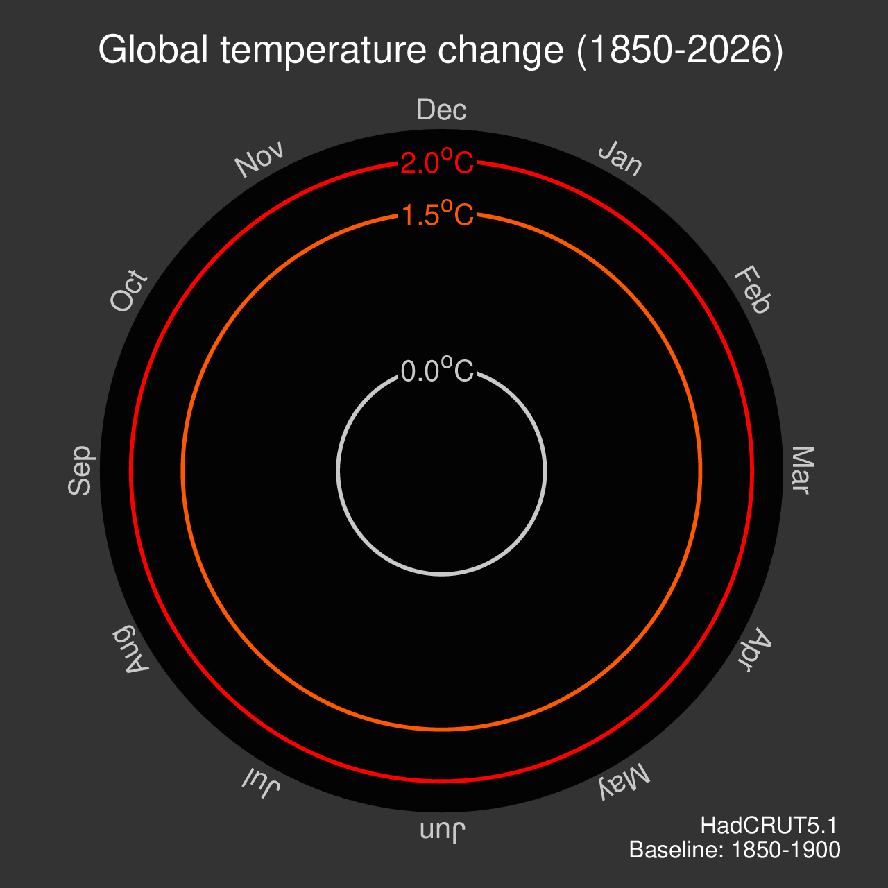
Spiralling global temperatures
A decade later...
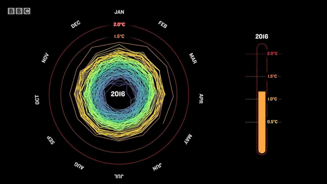
“Just a (crazy) thought”, said Prof. Jan Fuglestvedt in an email to me in May 2016.
A couple of days later, the climate spiral was born. The animated graphic shows the increase in global temperatures from 1850 to now, changing slowly at first before rapidly spiralling outwards in the last moments.
It instantly went viral.
People watched it over and over again, surprised at the speed of change over the past few years.
The animation still offers that power to shock a decade later.
Since May 2016, the spiral has had a remarkable journey.
Later that year, a version was shown during the opening ceremony of the Rio Olympics, watched by 1 billion people.
NASA’s Scientific Visualisation Studio regularly update their own version.
It is now even part of The Museum of Modern Art’s official collection.
Science and art have combined to tell a powerful story of how our planet’s climate is changing rapidly.