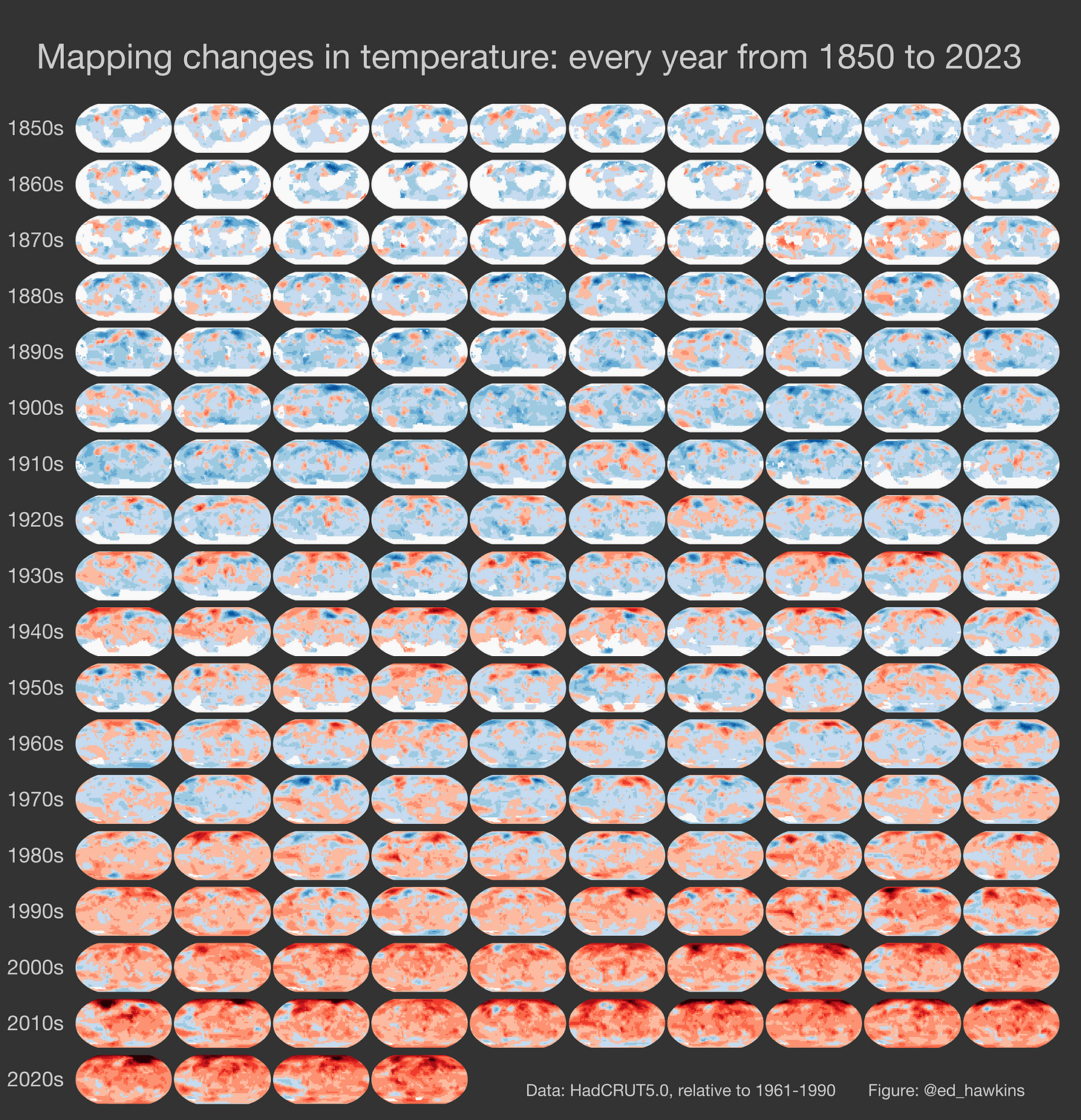
Mapping changes in temperature: every year from 1850 to 2023
Using a 'small multiples' visualisation technique
174 small maps. Each one showing temperatures across the globe in a different year from the 1850s to present. Blue colours show regions that were cooler than average in that year, with red colours showing warmer than average temperatures.
The rapid warming over the globe in recent decades is clear and stark. 2023 is almost certain to be the warmest on record.
Technical notes: this graphic uses the HadCRUT5 dataset with ‘average’ defined as 1961-1990. The map for 2023 is based on January to September only; all other years are annual averages with at least 6 months of data available for that location. White areas show where not enough data is unavailable.


Is there a high res version of this wonderfully pedagogical slide?