Mapping changes in temperature
Using the 'small multiples' approach
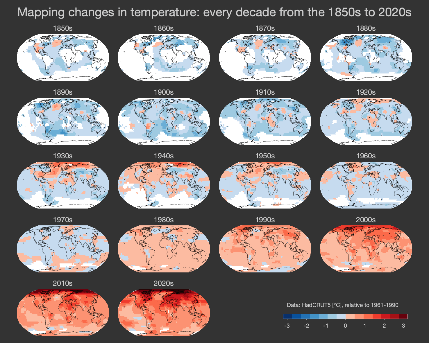
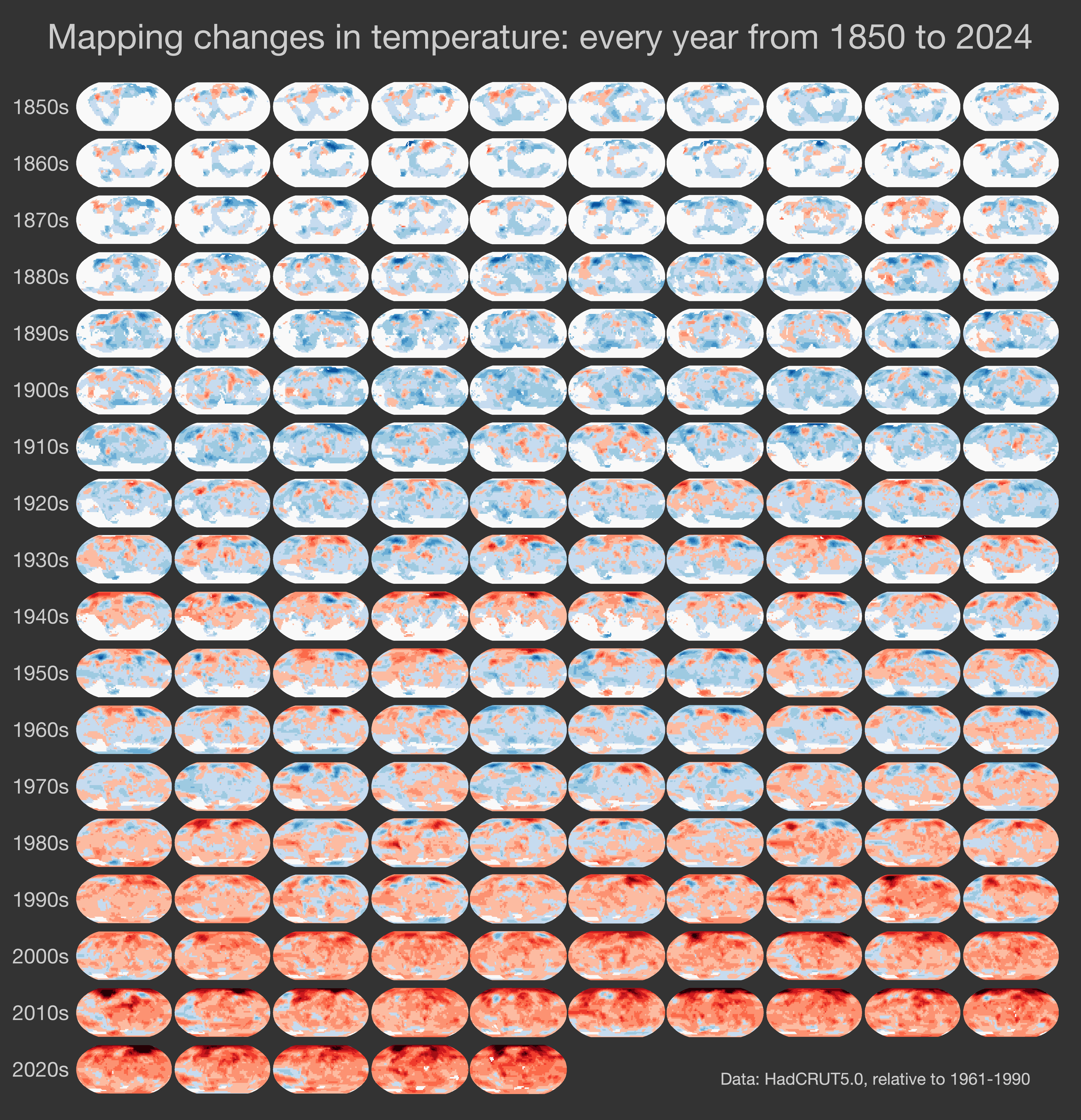
The dataviz technique of ‘small multiples’ can be a useful approach to highlight a key message - ‘the world is warming everywhere’ - by showing a large number of maps in a single figure. Some examples are shown below for changes in temperature, for both global and UK datasets.
More graphics: Climate Visuals