
Is it hot right now?
New interactive website launched to explore real-time UK temperatures
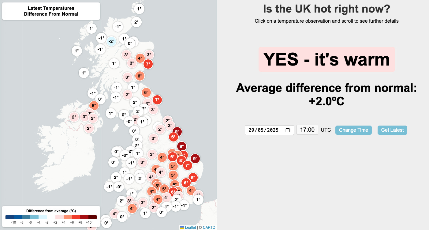
Today we make a new interactive website available which monitors UK temperatures hour by hour: Is the UK hot right now?
Every hour a global set of automatic weather stations openly report temperature and other weather measurements - these are called ‘synops’. For the UK, you can now see the latest temperature observations in the context of the past few decades.
The website shows a map of the UK, with each synop location’s most recent temperature, relative to what is ‘normal’. In the screenshot below, at 5pm on 29th May 2025, the UK was about 2.0°C warmer than normal, with relatively warmer temperatures in the east, and about normal in the west.
By clicking on each of the symbols you can see the latest temperature observation in context. For one chosen example location (Lyneham), the temperature was 20.3°C. Every historical observation (since 1971 in this case) for the same time of day, at the same time of year, is shown for comparison. The latest observation was 4.1°C warmer than normal - or ‘very warm’.
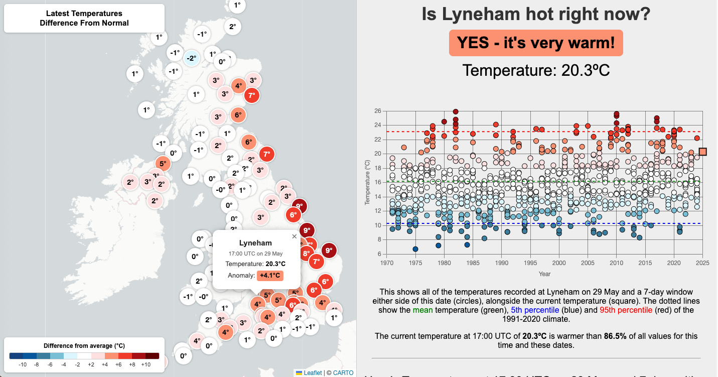
But, what is 'normal’? For this website we use the temperature observed at the same time of day and time of year, averaged over the 1991-2020 period, as ‘normal’. We would love to use a time period that was longer ago, but the hourly observations required were not taken in enough places. Nevertheless, this tool allows anyone to see how hot (or cold) it currently is near where they live, relative to recent experience.
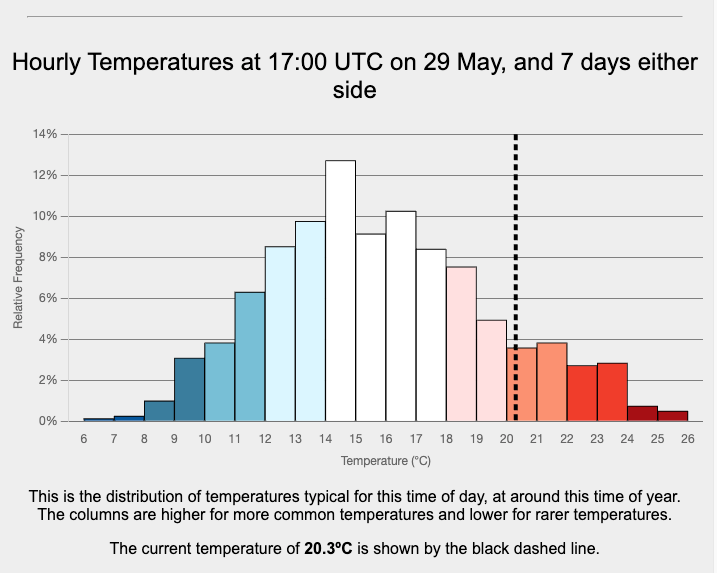
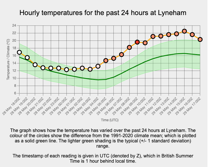
By scrolling down the page, two other comparisons are also shown for each location: (1) the distribution of temperatures being compared, and (2) the last 24 hours compared to normal (and you can click on each circle to change the map to that hour).
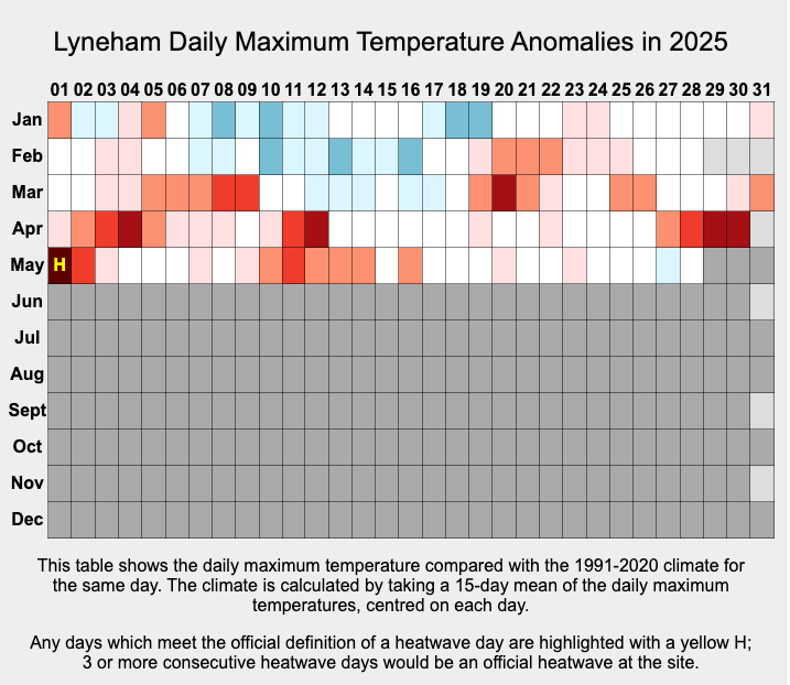
The final graphic available for each location shows the daily maximum temperatures in 2025, compared to the same historical 1991-2020 average. You can click on each day to bring up a map for that particular day.
We hope that this tool will be useful for weather forecasters, journalists, and anyone interested in the weather! Please let us know of any suggestions for improvements.
The website was built by Dan Harris with Ed Hawkins (supported by the Ireland-UK Climate+ Co-Centre), and was inspired by a similar concept in Australia.
Ed & Dan, Thank you for this.
Technical question. What triggers the descriptions "warm" and "very warm"? And presumably there is an "extremely warm" somewhere?
Do they correspond to 1, 2 and 3 standard deviations?
Best wishes
Michael
Will be really useful for teachers to show the nuance when we talk about warming and averages - thanks very much :)