
Comparing climate predictions with subsequent observations
How well did IPCC AR5 do?
In 2013, the IPCC AR5 WGI Summary for Policymakers concluded that:
The global mean surface temperature change for the period 2016–2035 relative to 1986–2005 will likely be in the range of 0.3°C to 0.7°C (medium confidence).
In the full report, Figure 11.25 showed this prediction.
A decade later, we can return to this prediction and update the graphic1, with revised observational datasets2. The red hatching shows the IPCC AR5 indicative likely (>66%) range for the 2016-2035 period.
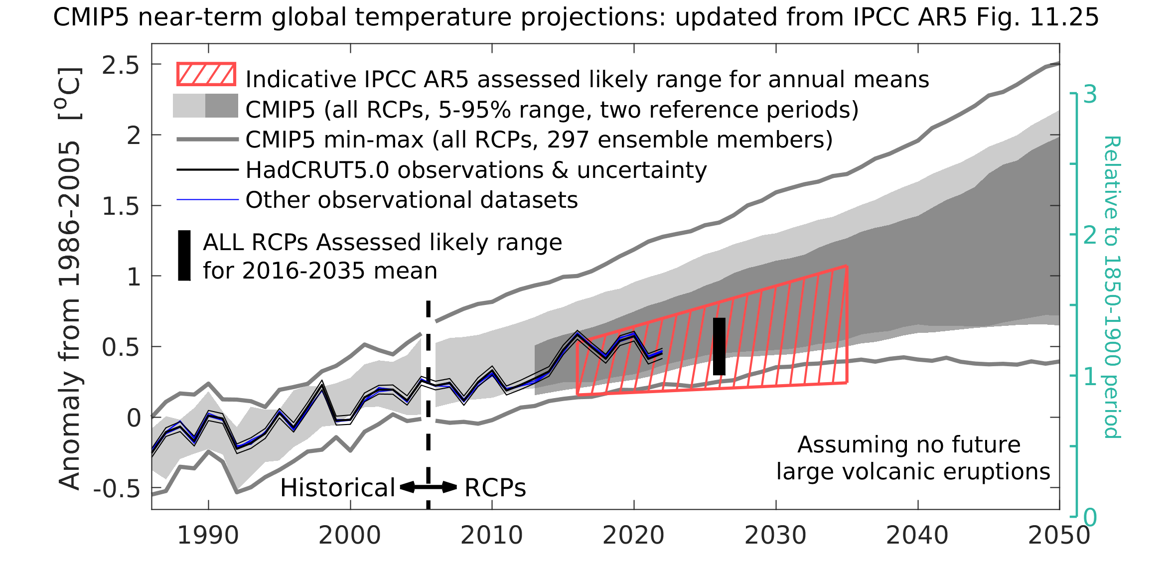
The light grey shading shows the CMIP5 5-95% range for historical (pre-2005) & all future forcing pathways (RCPs, post-2005) relative to 1986-2005. The dark grey shading shows the projections using a 2006-2012 reference period.
The observations now available for 2016-2022 fall in the middle to warmer half of the predicted likely range. 2023 is going to be near the upper end of the likely range.
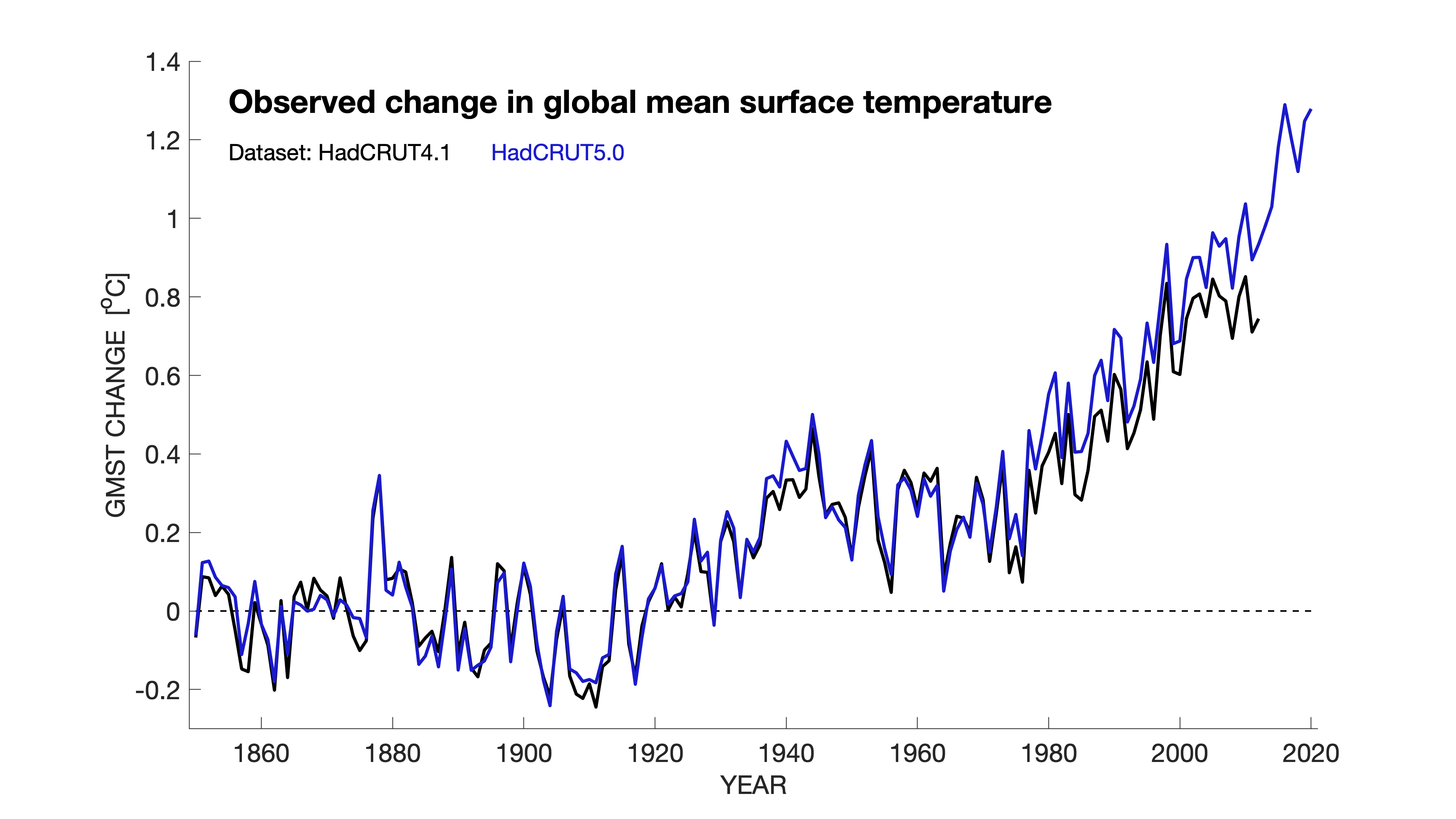
Overall, I think the prediction made in AR5 is still reasonable. However, I think that AR5 was perhaps a little cautious and the likely lower bound could have been 0.4K rather than 0.3K. There was emerging science around the time that AR5 was published showing that some existing temperature datasets were under-representing the observed warming due to incomplete sampling, but some of the literature was not published in time to be assessed. In the below graphic, the HadCRUT global temperature timeseries when IPCC AR6 was published (blue) looks quite different to the timeseries that was available at the time of IPCC AR5 (black) for the period up to and including 2012.
This is (obviously) not an official IPCC update.
HadCRUT5, NOAA GlobalTemp v5.1, NASA GISTEMPv4, Berkeley Earth, and ERA5. In AR5 it was assessed that 1986-2005 was 0.61K warmer than the 1850-1900 period (often used as the pre-industrial baseline) using HadCRUT4. Subsequent updates have increased this value meaning the green axis has been moved a little lower. This change also slightly shifts the grey shaded regions due to the reference period anomalies being different too.